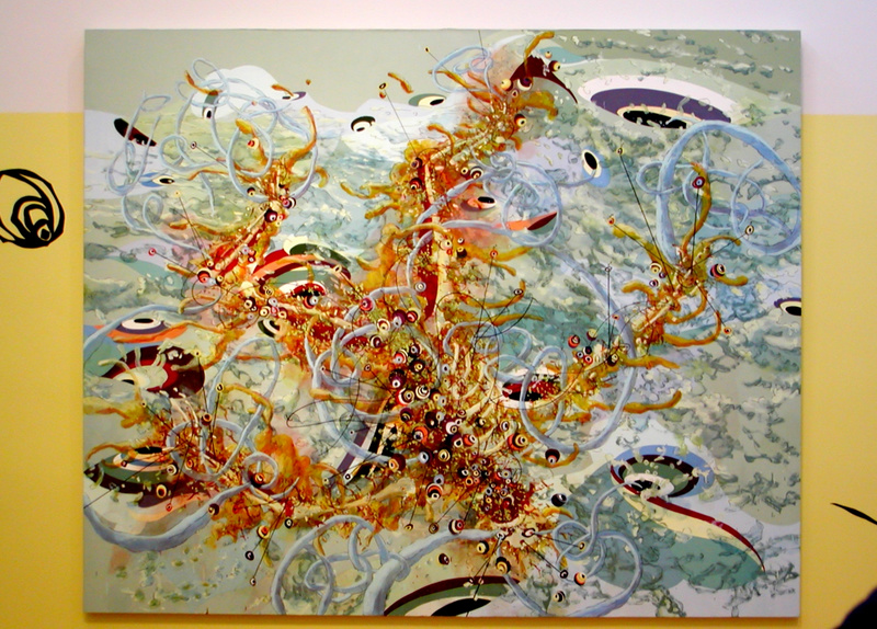
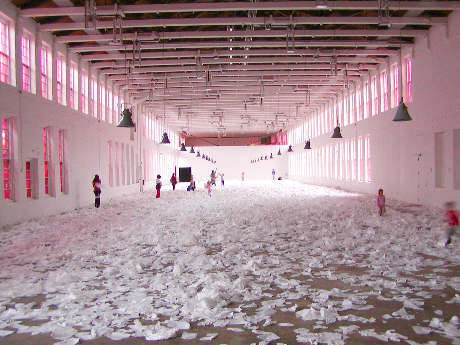
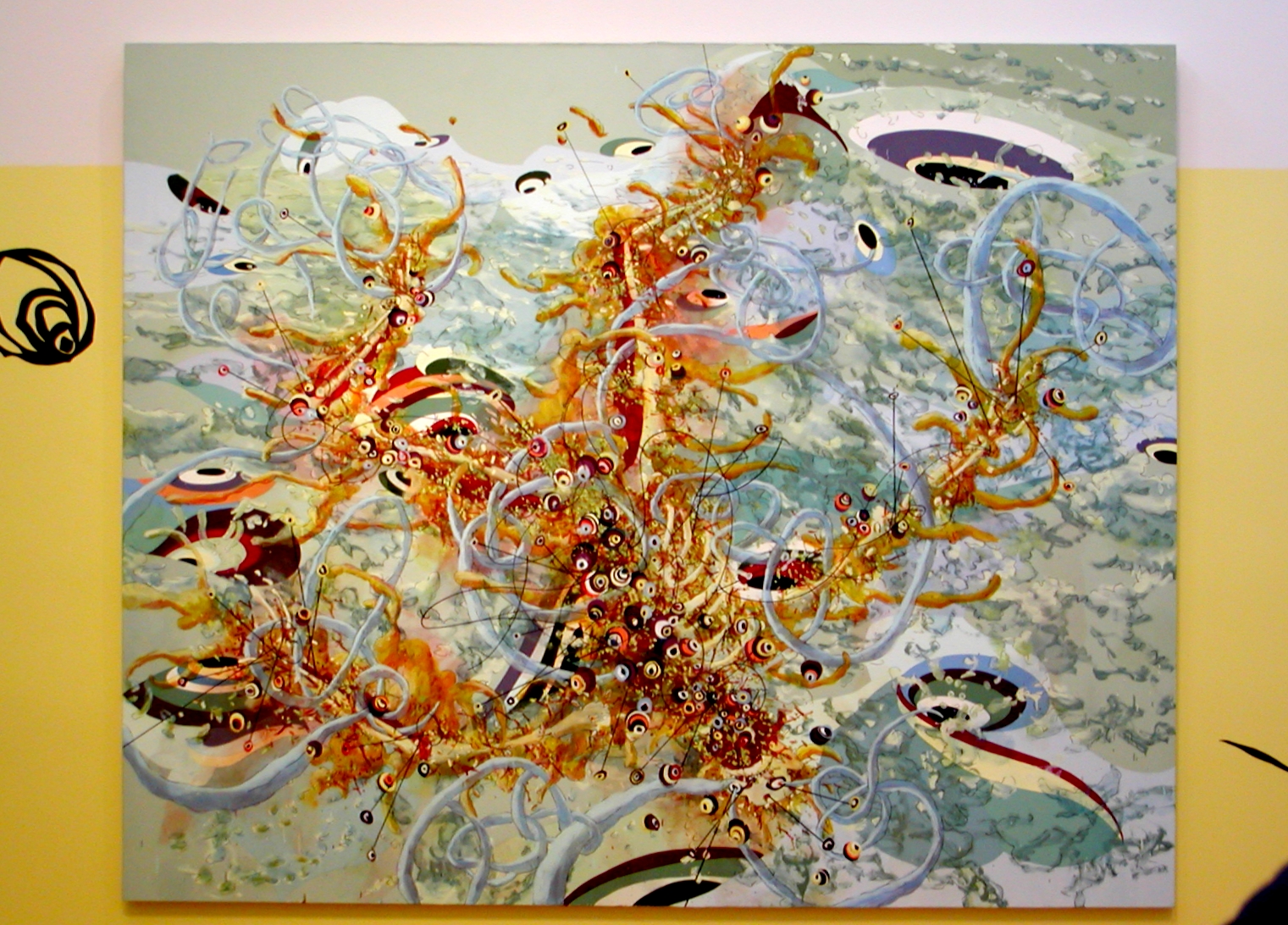
Thanks to this here blog, I am now a published photographer. In 2004 Char and I took a trip to Mass Moca and I took some photos of the installations we saw. One of these photos seems to have gotten some extra google-juice because twice now I’ve been contacted by authors wishing to use my photograph of Ann Hamilton’s “Corpus” in their publications. Each time I’ve only asked for proper credit and a copy of the publication.
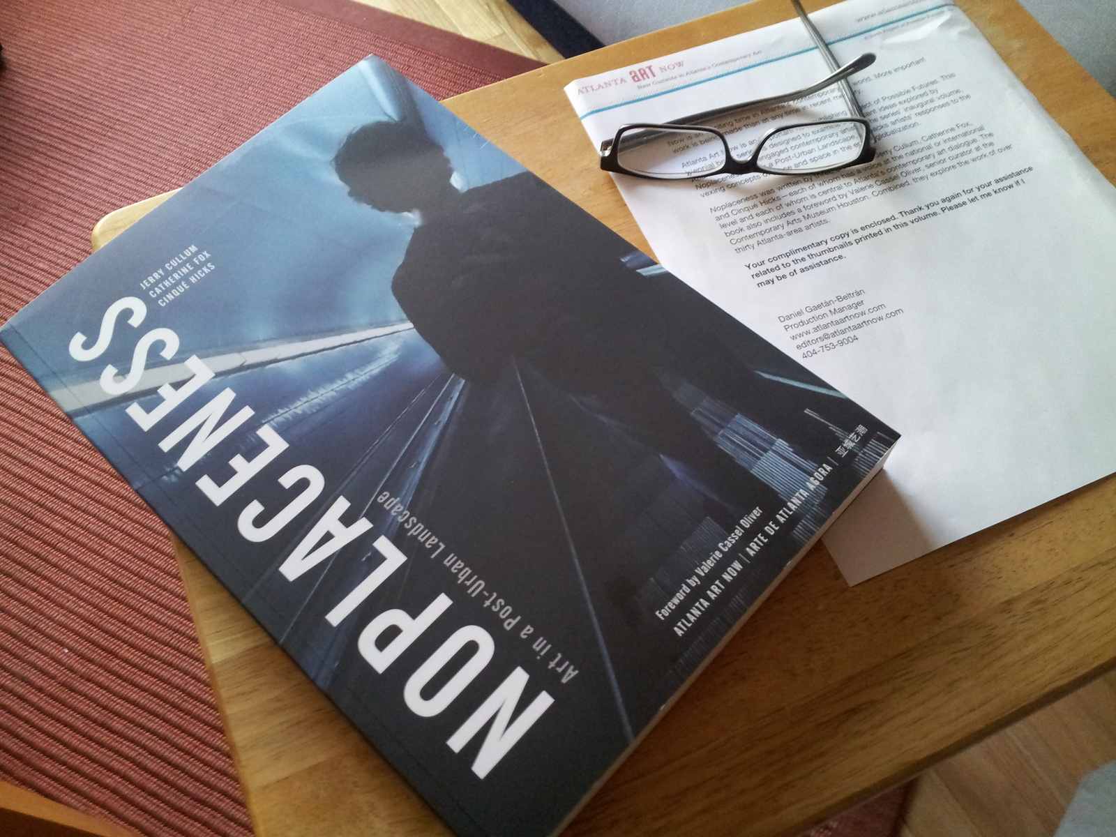
The first publication to use my photo was a small newsletter, but the second was a little more substantial as I found out when I opened the fairly heavy package I got in the mail:
“Noplaceness” is a product of Atlanta Art Now and is:
An incisive look at artists whose work reveals the changing perceptions of place and space in the era of globalization. Noplaceness features writing examining the work of over 30 artists in historical and critical contexts, including Scott Belville, Sarah Emerson, Ruth Laxson, Beth Lilly, Ann-Marie Manker, The Paper Twins, Fahamu Pecou, Sheila Pree Bright, Rocío Rodríguez, Angela West, and K. Tauches.
I haven’t read the articles yet, but the production quality is top-notch. The paper is really thick and the (many, many) photographs look excellent. You can even get it on amazon!
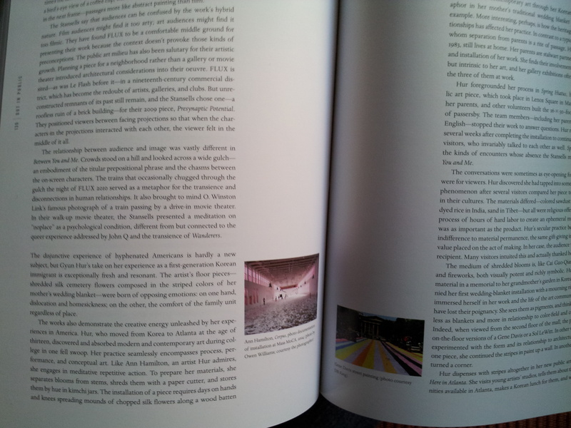
And (thanks to the index), there on page 130 (the left):
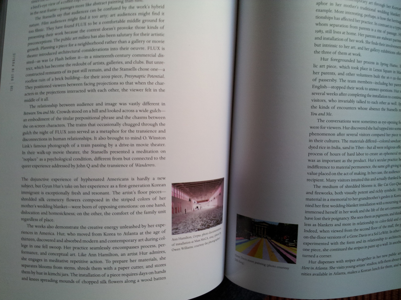
OK so it’s not a two-page spread or anything. I guess that’s why they didn’t need a higher resolution version of the original. For those too lazy to click on this handy link right here, here’s the original:
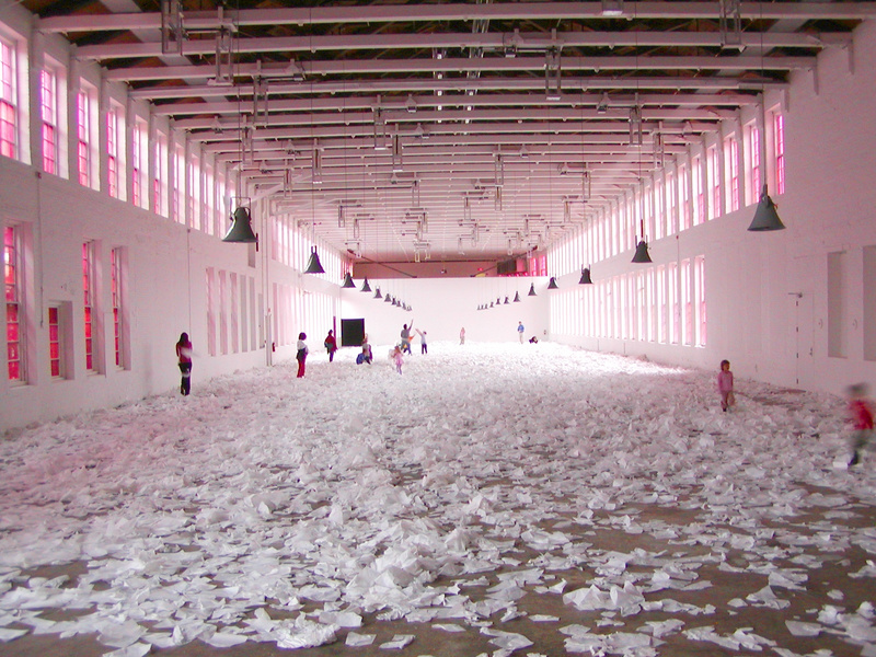
It’s too bad that a work of such huge scale had to get reduced to a 2″ image in a critical art book-thing, but at least anyone on the internet curious about Corpus will keep finding their way to my humble blog.


