Designing an online edit suite: An alternative desk

My last post was a good attempt at brainstorming how my new video editing desk should look. Unfortunately, the guy at Home Depot constructed the quote incorrectly, and didn’t include a 7.50$ charge for every linear foot of countertop for finishing the edges. Using the correct numbers, my previous design would cost 400$ more than I thought.

That put the price was back up to 1000$, which is just too high for a self-built desk. It was time to rethink the complicated concept of the strangely-shaped desk with wings. I recently went back to Powderhouse to do some work in their online suite where they just have a basic rectangular desk that’s 7 feet wide and 3 feet deep with a riser. I’ve been using that desk for close to four years now, and despite the square shape it works well.

The only problem with that desk is I can’t rotate the CC monitor as far as I’d like. It’s an older CRT model (( “Older” does not mean “out of date.”CRT monitors are still considered the best for color correction because they produce extremely dark blacks, but they just aren’t manufactured any more.)), and CRT monitors are big, heavy cubes. The riser is 18” deep, but even that depth isn’t enough to rotate the monitor properly. As I spin the monitor, the feet on the bottom quickly fall off the edges of the riser. I won’t have that problem in my suite because my CC monitor will be a shallow LCD panel on a swiveling base. I went home and created a new, simpler design nearly identical to what I’d been using at Powderhouse. Using the new, more accurate numbers I had from Home Depot, I got a total price of $600 or so.

About this time, another option presented itself. Char told me that just up the road was a furniture liquidators store — they have thousands of square feet of warehouse space and buy old cubes and desks from companies for reselling. Although standard office furniture doesn’t work right for me, the company also fulfills custom quotes. I took a short drive up the street ((it was very cold, or else I could have walked)) and worked with the nice woman at the warehouse to draw up a design. What I got back was just what I wanted — the desk I’d been using all this time:
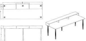
Custom desk design
Custom desk design

The price was higher than the Home Depot + Ikea option, but not by much, and I wouldn’t have to attach the legs or construct the riser myself. I only had a vague plan for nailing lengths of shelving together to make the riser, so having it included was a big plus. Furthermore, it’s a real desk, not a homebrew combination of countertops, legs, and lumber. It will be all black with matching legs. So I ordered the custom desk. It won’t be ready until the end of January, but it’ll be worth the wait.

Eventually I will need at least one side desk, but I’ve decided I can wait until the last minute to buy it. Unlike huge, editing-specific desks, small desks are a dime a dozen and can be had everywhere. When I need one, I’ll stop by Staples or Ikea and get it.

Designing an online edit suite, Part 2: Furniture and Space

This is my second post about my plans to construct an online editing and color correction suite for my own work.

As I suspected, this designed changed and the quote below is inaccurate. So, please disregard the plans contained within. Instead, check out the final desk I decided to purchase

Last time I talked about what computer equipment I would probably need in my edit suite. Now that I’ve got all this great (hypothetical) hardware, where do I put everything? I could just get a cheap desk and a folding chair, but that’s the wrong way to go. I need to work efficiently, and a plain rectangular desk is not the right shape for working with three monitors, a keyboard, and a tablet. I also can’t cheap out on the chair unless I want to get carpal tunnel syndrome.

I also have other reasons for not skimping on furniture. For a production, online editing and color correction are some of the highest dollar-per-hour expenses. The equipment is expensive, the labor is highly-skilled (IMHO), and the time-frame per job is short. Clients rightly want to feel like they’re getting their money’s worth. It’s hard to see where that money is going if the equipment is in another room, and watching someone use a computer is notoriously boring.

This expense is why million-dollar online rooms have track lighting, espresso machines, and leather couches. It’s similar to the broken-windows theory ((see also this dutch study.)). If I have a cheap desk and a broken couch, that implies I take the same attitude toward my hardware purchases — it’s probably a bunch of half-working cobbled-together junk. Sure, I could charge the client less if I didn’t spend so much on the decor, but the percentage of the budget spent on furniture is small compared to the hardware and software. Physical goods are more cost-effective than electronic, so a smaller amount of money goes a longer way.

The Desk

The most expensive piece of furniture is The Desk. Entire companies exist just for making media desks and furniture. These desks are very nice. They curve around, so the operator can look directly at all the monitors. They have risers, which provides more space for mixers, consoles, and other gadgets. They are also really, really expensive, like $3000+.

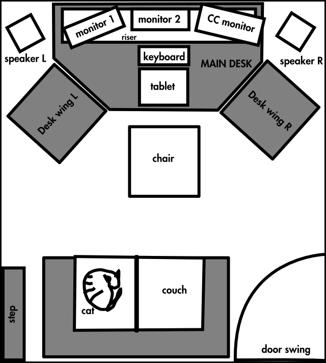
I want to hit a sweet spot — not a regular rectangular craigslist desk, but not a crazy-expensive professional media desk. My best option is to build it myself. I don’t have a CAD program, but I do have a vector-graphics program called Inkscape that is similar to Illustrator. I set my units to inches, and simply drew the room with a desk in it:

Desk drawing

For the monitors, tablet, keyboard, and chair, I drew rectangles the same size as the items themselves. I let these objects determine the size of the desk. Right now the space between the chair and the couch looks a little tight, but the couch and door are estimations ((Char insisted I include the cat for scale)). The speakers are shown free-standing, but I may end up just putting them on the desk.

I wanted to get the wrap-around effect using simple shapes, so I started with a rectangular top and chopped the corners off. Then I can make two smaller wings that fit flush onto the diagonal sides. The wings may have four legs (so they can move), or I might give them only two legs and have them attach to the main desk. The riser consists of a simple bookshelf with some more board screwed and glued to elevate it.

I went to Home Depot ((I’m not even going to link to their web site, it’s worthless)), and found they can make a custom countertop with a simple flat black finish for 14$ a square foot. I can get them to make the tops and then attach adjustable-height legs from Ikea to complete the desk. Adding everything up, this is what I get:

Note: I haven’t built this desk, so I may discover that the legs are no good or the particleboard counter needs reinforcement. This post is not sound construction advice.
Desk Tops:
per sqft w h
Main Desk $248.76 $13.82 72 36
Desk Wing L $55.28 $13.82 24 24
Desk Wing R $55.28 $13.82 24 24
Legs:
per leg # of legs
Main Desk $90.00 $15.00 6
Desk Wing L $30.00 $15.00 2
Desk Wing R $30.00 $15.00 2
Main Desk Riser:


Regular shelf $14.00
wood to rise $10.00
Main Desk Total $362.76
Single Desk Wing Total $85.28
Subtotal $533.32
Tax $26.67
Total: $559.99

Is 560$ too much to pay for a good desk? It’s half the lowest price I’ve been quoted for either professional edit furniture ($3000) or a custom-made birch desk ($1000). It’s only 5% of the cost of the rest of the editing suite.

Other than the desk, there are a few other basic things I will need, all of which I can get for free or are inexpensive:

  • Couch: I may have access to a free loveseat, and if it’s presentable and comfortable I’ll use that. Otherwise, Ikea to the rescue again!
  • Main lighting: I will probably bring my nice floor lamp from home, where I’m not really using it
  • Back lighting: I just need a small fixture to aim at the wall. This can be inexpensive because it’s hidden

The nice thing about this room is that the server room is on the other side of the wall. This means I can run the cables through the wall and put all of the computers with their loud, whiny fans in there, keeping the online room quiet.

3 for 3.0, and Project Sandbox

There has been a lot of discussion recently about the future of GNOME and the stasis that the project seems to have reached ((I dislike the term “decadence,” because it seems to imply abundant wealth going to waste. GNOME will never be the wealthy-person’s OS of choice. That would be OS X)). I think that stasis is not a horrible place to be. As others have said, having a desktop that is stable, useful, and predictable is a good thing. Developers have worked hard to get the desktop where it is, so let’s give them all a pat on the back before we discount all that’s been achieved.

But, as an application developer, I see some shortcomings to GNOME that is preventing further progress in user interface design. There are technical limitations, but there are also social limitations working against progress. On the technical side, GTK needs some changes to allow more developers to take user interaction to the next level. On the community side, there needs to be an official GNOME-sponsored forum in which to experiment free from criticism.

To enable developers to try new things, GTK may need to break ABI stability and move to version 3. I call it “3 for 3.0” — the three features GTK needs to move forward:

  1. Multi-input from the ground up: Right now GTK reacts to one event at a time. It’s possible to make an application look like the user is doing many things at once, but true multi-touch and multi-user interaction is not really possible — or at least it’s too difficult for moderately-skilled developers (like me) to achieve.
  2. First-class Animation: GTK needs to perform animation by default. There are ways to make widgets spin, slide, and fade, but they are all hacks. I should be able to fire off an animation and perform other functions while it is animating. I should get a signal when the animation is complete. Built-in state management would be a key feature. There should be a standard library of basic transitions and special effects that anyone can use with minimal code (like fade, push, wipe).
  3. 3D-awareness: GTK doesn’t need to be 3D itself, but it should understand and be ready for 3D. 2D apps will never disappear, but there will be a need for a bridge between 2D and 3D. This could mean that GTK would support a z-buffer, or perhaps it would have a blessed 3d-canvas like Clutter. Or perhaps it could have access to OpenGL to provide various compositing and shader effects.

Perhaps some of these effects seem only useful for pointless flourishes that will slow down interactivity and increase processor overhead. I would argue that what GNOME needs right now is some stupid slow-ass eye-candy. Look at Compiz Fusion. It has dozens of gaudy effects, half of which are useless and most of which have way too many settings. But I love playing with it. It’s been a fertile sandbox for developers to go in and see what works. Maybe the “fire” transition is a waste of time, but there are a few Compiz features that are genuinely useful and I use all the time. The “enhanced zoom” feature, for instance, is a perfect way to blow up a youtube video without making it full-screen.

Every now and then I see a screencast from a GNOME developer working on a little pet project, and some of those demos have been amazing. Whenever I go to the GNOME Summit in Boston, there’s always some guy with his laptop, and he says, “take a look at this –” and proceeds to blow everyone away with some awesome thing he’s been working on. It’s rare, though, for those hacks to escape from that single laptop onto anyone else’s.

GNOME needs a Project Sandbox — an official, gory-edge (it’s past “bleeding”), parallel installable set of libraries and programs (“Toys,” perhaps? ((The exact terminology isn’t important, I’m just keeping the Sandbox metaphor going))) with all of the crazy hacks developers have been trying. It should be housed in a distributed SCM, so developers can push and pull from each other, mashing features and screwing around with GTK “3”, Clutter, Pyro, and whatever other toys people come up with.

The Sandbox should have two rules:

  1. No Kicking Sand ((alternate title: “No Pooping in the Sandbox”)) — ie, no stop energy. Anything goes, no matter how hacky. Developers should be able to prototype ideas quickly, no matter how cracked up they may be. The good ideas will stick and can be re-written cleanly. Nobody, not Apple, not Microsoft, not Nokia, knows what will really be useful in the future with multi-tap and 3D. Apple has a head start, but that doesn’t mean they have all the answers.
  2. Anyone Can Play: If I pull from your tree, I should be able to build and install what you’ve made. It does no good to have a toy if it only works in your corner of the sandbox. There might be some cases where a feature requires a certain video card, but developers should make a good faith effort to make code build and install on systems other than their own. Setting up a development environment is Hard, but I wouldn’t care if I needed 4 hacked copies of GTK each with different .so-names. Disk space is cheap! Computers are fast!

GNOME has done a good job of reining in developer craziness and promoting consistency and uniformity across the desktop. That was good, and was necessary while the desktop was maturing. Now it’s mature, and those reins need to be lifted, or at least relaxed. The stable desktop can plod forward steadily, but developers need a place to relax, rip off every feature from the iphone and Vista, and more importantly make that code public without fear of attack. What’s worse than a flame on Planet Gnome in response to a crazy feature? The feature that doesn’t get written for fear of being flamed.

a window on another world

“Next to the name of one regular, who has a habit of bringing in women he is not married to, is an instruction to make sure the man’s wife has not booked a separate table for the same day.”

The New York Times, 6/18/07.

The great thing about the Times is, even when their articles are hopelessly behind the curve (you mean you can reserve a table OVER THE INTERNET???!!), there are sometimes little nuggets of gold on the inside. The best of these come in the form of revelations about how “the other 1%” ((My dad coined used this phrase while we were biking this weekend in Weston, MA. I like it.)) live. In this case, we learn about a man who is so rich, his restaurants help make sure his wife doesn’t find out about his regular infidelities. I’m lucky if the person at the Qdoba realizes I’ve been ordering the same thing once a week for two years!

I haven’t had this much fun learning about rich people since the Escapes article in which one fellow has a summer house in Phoenix that he keeps permanently air-conditioned so it would be cool if he decides to visit.

Moment in the Sun

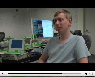
Chris Blizzard let me know a while back that Red Hat Magazine was coming to the olpc offices to shoot some promotional video, and that they might want to interview me. So I dropped on by after work and gave them some good bites.

They’ve posted the edited video, which is a pretty nice peek into the place where the magic happens. It’s not my best on-camera appearence ever, but luckily they cut away from me pretty quickly 🙂

Me appearing in the olpc video

OLPC as a music player

One side project I’ve been having fun with is creating an activity to allow the olpc to play music. At first I was just going to port a MusicPD (mpd) client over to olpc to allow me to use the laptop as a remote control at parties. Mpd runs as a system-level service that plays music, and then users can connect to it with many dozens of available clients to tell it to play music. It turned out that porting over a client was so easy that I decided to create a bundle that had its own mpd daemon builtin as well.

The client I chose is Sonata. I’ve used a lot of music players, including xmms, rhythmbox, amarok, banshee, and muine, but the combination of Sonata+mpd is the best way to enjoy music on Linux. It’s really, really good, and it’s worth the slight headache of setting up mpd.conf to get it working on your machine.

Sonata is also written in Python and only took maybe 20 lines of alteration to sugar-ize it. The author, Scott Horowitz, was even nice enough to incorporate my alterations into the main codebase, meaning that my bundle isn’t a fork of his project.

The bundle also contains a specially-compiled and configured version of the mpd daemon. And since I hate freedom, I’ve bundled an mp3 library along with it (But it also plays ogg). Music should be stored in /home/olpc/.mpd/Music, which could be symlinked to a mounted mmc device or USB key for greater storage. When the activity is started, the daemon is automagically started as well.

By default the client will connect to the olpc’s mpd daemon, but one can right-click on the main window and change the preferences to connect to any other mpd daemon on the network.

While I don’t know if this bundle will be useful to the kids, it’s useful to me and it shows the power of the bundle architecture. It really is plug and play 🙂

Sonata OLPC bundle (v7)

Creating GPS route maps from google maps

This is an expansion of the excellent work done by Mr. Davis at his Open Source GPS HOW TO page. He has a google maps hack here that allows one to make a GPX xml file by clicking on intersections. This is a very quick way to make a route map.

I wanted to expand on his work in two ways:

  1. I wanted to fill in waypoint names for items that were left blank, and
  2. I wanted to automatically check for waypoint name duplication, because duplicates cause data to be overwritten in Etrex GPS devices.

I wrote a python script that does both things. All one has to do now is:

  1. Create a map on his website
  2. Name major waypoints on the map (I like to name intersections using the name of the street I’ll be turning on to)
  3. Save the GPX file to disk
  4. Run gpxrecode.py [inputfile] [outputfile]

gpxrecode removes the leading number and hyphen from the waypoint name. If the waypoint is blank it gives it the same name as the last one. If the waypoint is already in a cache of waypoints, it adds a number to the end of the name. The cache is maintained between runs of the program, so multiple routes shouldn’t clobber each-other’s names.

Source after the break.

Continue reading “Creating GPS route maps from google maps”

Most evil phish yet

I got this today:

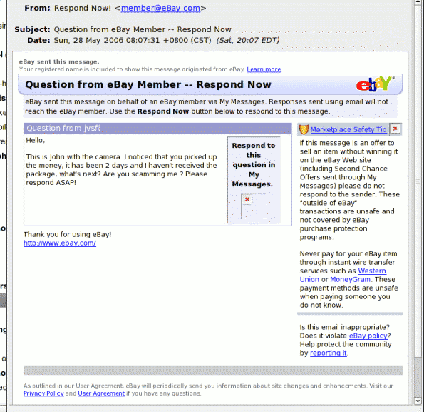
evilphish.gif

This is the most evil phishing message I’ve gotten yet. “Oh my god! What money? What camera? WHAT ABOUT MY EBAY FEEDBACK RATING?????” Of course all the important urls lead to classic ‘http://somecrap.com/ebay.com/lotsofjunk,’ and I’m sure if I followed those links I’d be asked for my ebay password. I know some people who would get very upset by an email like this and might’ve clicked on the links. Bad phishers! Stop being so devious!