HOWTO: Change the terminal title when commands are running

In the work I do I often have a lot of terminals open, and some of those terminals have a lot of tabs. Sometimes I start a process that’s going to take a long time and I’d like to quickly see if that process is still running or if it has finished. While this is tricky, it’s possible! This HOWTO is bash-specific and is designed for Ubuntu, but it should work on other distributions with minimal changes. Thanks to this url for getting me started: http://superuser.com/questions/42362/gnome-terminal-process-name-in-tab-title.

Step one is to make sure that your current settings do not change the title of the terminal. On Ubuntu there’s a block of code in the ~/.bashrc file that says “If this is an xterm set the title to user@host:dir“. Just comment out that whole block by putting # characters at the beginning of each line to disable the functionality.

# If this is an xterm set the title to user@host:dir
#case "$TERM" in
#xterm*|rxvt*)
#    PS1="\[\e]0;${debian_chroot:+($debian_chroot)}\u@\h: \w\a\]$PS1"
#    ;;
#*)
#    ;;
#esac

On other systems you will have to look around for where the value of PS1 is set. Look for “\e” — this is the code that tells bash what title you want to use. We want to override this, so delete everything from \e to \a.

Step two is to insert new code into ~/.bashrc (or wherever your system prefers). I put this code right after the existing PS1 code that Ubuntu shipped.

# Custom title-setting code that adds a triangle play-arrow
# if the terminal is not waiting on the prompt
case "$TERM" in
xterm*|rxvt*)
    # This tells bash: before showing the prompt, run this
    PROMPT_COMMAND='echo -ne "\033]0;${THIS_TERMINAL_TITLE}\007"'

    # Edit the title if a command is running:
    # http://www.davidpashley.com/articles/xterm-titles-with-bash.html
    show_command_in_title_bar()
    {
        case "$BASH_COMMAND" in
            *\033]0*)
                # The command is trying to set the title bar as well;
                # this is most likely the execution of $PROMPT_COMMAND.
                # In any case nested escapes confuse the terminal, so don't
                # output them.
                ;;
            *)
                echo -ne "\033]0;▶ ${THIS_TERMINAL_TITLE}\007"
                ;;
        esac
    }
    # The DEBUG signal simply announces the last-run command
    trap show_command_in_title_bar DEBUG
    ;;
*)
    ;;
esac

# Now we can set the title of the terminal with terminal_title my title
function terminal_title ()
{
    export THIS_TERMINAL_TITLE="$@"
}
# Here's a good default
export THIS_TERMINAL_TITLE="$USER@$HOSTNAME"

This code works because of a few obscure features in the bash shell. The first is the existence of $BASH_COMMAND — a variable that holds the value of the currently-running command. Second, the trap command which allows us to take action when commands are executed, and third, the $PROMPT_COMMAND variable which tells bash to execute a command before showing the command prompt. With these features, we can change the title when commands are executed and change the title back when the commands are done executing.

In my case all I do is take the current terminal title and add a play-like triangle character to the beginning while commands are running. When the commands are complete the old title is restored and the triangle disappears. One could extend this feature by taking the value of $BASH_COMMAND and adding it to the title. By default the terminal title is just $USER@$HOSTNAME but I’ve added a function which allows me to change the title to anything I want.

Step three requires you to either log out and log back in for the changes to take effect, or to run source ~/.bashrc in order to execute the commands. Note that some terminals have to be set up properly to allow their titles to be changed. In gnome-terminal, go to Edit / Profile Preferences / Title and Command and make sure “When terminal commands set their own titles” is set to anything except “Keep initial title.” Also, if you have set a custom title in gnome-terminal itself by right clicking a tab and selecting “Set Title…”, you’ll need to erase that custom title by selecting “Set Title…” and erasing the text inside there. This can be a little tricky, and logging out may be the simplest solution. If you’re still not seeing the terminal title change, check echo $PS1 and make sure there is no \e visible.

Now when I run a long compile or test command, I see a ▶ in the titlebar and tab of my terminal. When the triangle disappears I know my command has completed. Please share your favorite extensions to this feature in the comments!

Keybinding GTK to shifted numbers

GTK (and I think QT also) has a fairly intuitive system for binding keys to commands: Control 3 is just "<Ctrl>3". However when you want to bind a key with Shift, things get tricky. I had tried "<Ctrl><Shift>3", and "<Ctrl>#", and "<Ctrl><Shift>#", all without success.

To make this particular keybinding work, you have to use the special X11 keysym name for that key. I found permanent url that describes these keys here, and a better list with printable characters here.

So for my example, the proper binding would be "<Ctrl><Shift>numbersign".

However keybindings like this are very tricky and shouldn’t be used in production applications (this example is a personal plugin for GEdit). This is because keyboards in other countries have different symbols over different numbers. So it’s not a given that Shift-3 is the same as numbersign in every country.

Making ‘find’ simpler on linux

The “find” command, which searches directories for files, is great but requires a lot of options to perform a simple search. Usually I want to search the current directory for a specific file name, but doing that requires all this typing:

find ./ -iname "*my_search_term*"

What I would like to be able to is just type:
f my search term

and have it match files that look like that. Here’s a little bash script I call “find.sh” that does it:

#!/bin/bash
args=`echo "$*" | sed -e "s/ /*/g"`
eval find ./ -iname \"*$args*\"

then just put the following in your ~/.bashrc
alias f="/location/to/find.sh"

This script takes the arguments, converts spaces to wildcards, then does a case-insensitive search of the current directory. So “f foo bar” gets translated to find ./ -iname "*foo*bar*"

Ideas for GNOME Shell

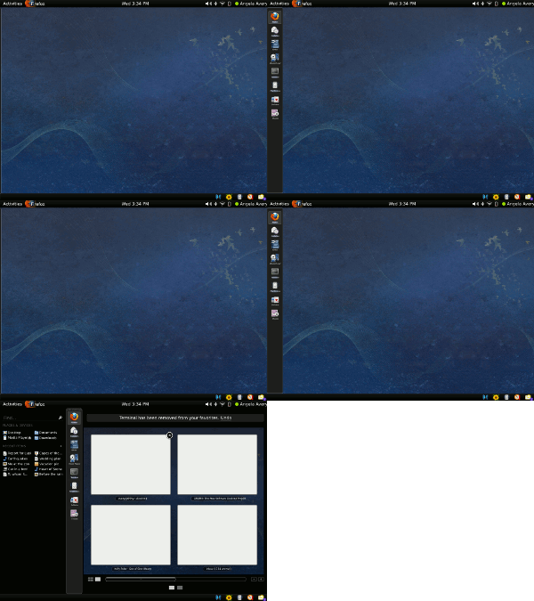
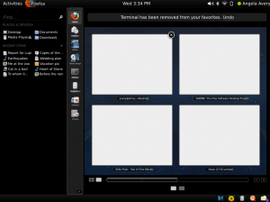
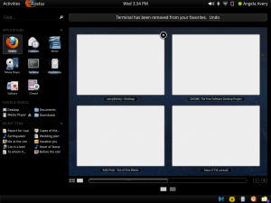
GNOME Shell is an interesting project that is trying to redefine how users interact with their applications, windows, and documents. The project shows a lot of promise, and works quite nicely in practice. While I like the overall design, I dislike the current system for launching common applications. Right now, the “activated” mode of GNOME Shell looks like this:

Current GNOME Shell mockup

Nine spaces for commonly-used programs? Not enough. Furthermore, if I just want to launch a program, I have to reveal dozens of UI controls that I’m uninterested in, including the search box, workspace manager, and all sorts of devices, places, and documents.

On my personal GNOME desktop, I have a panel of quick-launch icons on my desktop arranged on the left side of the screen like this:

My Current Panel (click for big)

It’s similar to an OSX Dock — it is normally hidden, but a simple mouse hover anywhere on the left edge of the screen reveals the launchers. This makes it very quick to launch programs. Since the current GNOME Shell design already makes use of the left side of the screen, it should be possible to combine the efficiency of a launcher panel with the power of the full shell. Clicking on the Activities button or moving the mouse to the top left corner of the screen would open the full view like it does now, but hovering on the left edge of the screen would just pop up a panel of application launchers.

I made a very simple mockup based on the one by William Jon McCann:

My GNOME Shell mockup (click for big)

The launcher panel becomes a sort of sneak-peak of the full view. If you just want to launch a program, just the left edge of the panel slides into view. If you want the rest of the controls, the rest of the UI slides out. With the right animation, this could be a really cool effect.

This mockup is far from perfect. The part that needs the most attention is the full view:

gnome-shell-owen-a-1

There are a lot of details that are easy to criticize here. The “Applications” heading is quite small, and very crowded. The ugly [+] button at the bottom is an afterthought to provide some way of adding more launchers. The launchers are still too big, especially with the application name text underneath each one.

Despite these layout flaws, I think the concept holds up. In its completely collapsed mode, the slight visible edge of the launcher panel acts as a hint to new users that there is functionality to the left side of the screen. The half-revealed launcher panel is efficient and usable. And the full view provides the screen real estate necessary to customize the more compact view.

Launching programs needs to be super-simple for new users, and super-quick for advanced users. This design satisfies both these requirements. I would also argue that it leads users from familiar territory, a launcher bar, to a new UI concept that’s a little strange at first. Introducing a brand new interface is scary for users, so providing this path would make adoption easier.

Here are the three states for the new shell:

gnome-shell-owen-c-1 gnome-shell-owen-b-1 gnome-shell-owen-a-1

DJing on the cheap

One thing I’d always wanted to try was DJing, because hey, doesn’t everyone? It’s like being a musician but without all that hard work, skill, and practice. I’d never really pursued the interest, though, because being a DJ, even as a hobbiest, had always been an extremely expensive proposition. Good turntables cost 600$ each, a mixer is another $100 or more, and there’s all the vinyl I’d need to buy. I know myself well enough that I didn’t want to risk dropping close to a grand on a hobby that, in all probability, I’d lose interest in after a month.

In recent years, laptop DJing has gotten more popular, but I still didn’t want to spend 500$ on the software and more on the mp3 music. I could have acquired these by bittorrent or whatever, but I don’t like stealing software and also hate rebooting into windows. Ideally I wanted an open source program that would run on linux, but most of the options I found sucked. My dream of being a superstar DJ appeared forever out of reach.

Then one lazy day of clicking around the internet I discovered Mixxx, an open-source DJing application. Amazingly, it doesn’t suck. After some experimentation, it became clear Mixxx not only didn’t suck, but was actually pretty good. Around the same time, I’d also discovered the wide world of netlabel music. There are artists all over the world who are more than happy to share their tracks for free on the internet. Because I’m not stealing the music, it’s easy to preview tracks and download the ones I like. I quickly built up a catalog of a few hundred decent tracks. I was very close to actually being able to mix music! Visions of neon-haired techno girls danced in my head.

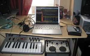
So I have software, I have music, and I haven’t spent any money yet! The Mixxx developers recommend the Hercules DJ MP3 as a good cheap controller, so I snagged one off ebay for 70$. I also have a small older version of this M-Audio MIDI keyboard which I got used for 60$ or so ((I got this when I was playing around with freewheeling, until I realized I don’t play the keyboard)). Lastly, I have an M-Audio Sonica Theater for simultaneous main mix output and headphone preview output ((I also got this from ebay, used. There’s a lot of decent hardware out there that doesn’t really go bad)).

With all of that, my setup was complete:

Laptop, sonica multichannel sound card, midi keyboard (for effects), and Hercules DJ MP3

Total cost: ~$150

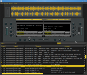
I got some practice spinning tunes, and quickly discovered all sorts of annoying problems with Mixxx and my setup. The default mixxx theme, for instance, is ugly and doesn’t use screen-space well. I downloaded a cool-looking theme called “Trancer”, but then I wasn’t happy with that so I did what any linux user would do — hacked it and made my own version:

My custom Mixxx theme, which fits nicely on my 1280x800 screen

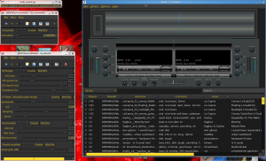
I also wanted to have more control over filters and effects, so I set up a JACK pipeline so I could use my MIDI keyboard to select and tweak effects outside of Mixxx itself. I use the jack-rack program to handle the effects, although I had to hack that too. So when I’m mixing, this is what my desktop looks like:

Mixxx on the right, a couple jack-racks on the left, and a little midi notifier at the top left

And while I was playing some music, I discovered some aspects of the Mixxx music library that I didn’t like. Like, I needed some way of knowing which tracks I’d already played so I wouldn’t accidentally play them again. Also, the search bar also didn’t allow for multiple search terms. So I hacked away at the mixxx source code. Now the search box works right and I know if I’ve played a track as well as how many times I’ve ever played it.

But what type of open-source advocate would I be if I kept this all to myself? So, I present:
Mixxx Trancer theme (DJO remix)
Mixxx 1.7 (DJO remix diff)
jack-rack 1.4.7 (DJO remix diff)

The most important patch is the one for mixxx itself. The library is really hobbled without it.

After all this hacking, I finally have a setup that works well. I’m sure a European jet-set lifestyle is not far behind, but although I’ve been mixing for like, close to two months now, I’m still not a superstar DJ. But I did record one session that I consider post-worthy. I call it, “Mixxx session 090710.” Future mix postings will have a full tracklist, but due to a mistake, this one doesn’t. Enjoy!

Mixxx Session 090710 on archive.org (88 Meg, 1 hour)

Elect-o-meter for linux

Boingboing had a neat post about an “elect-o-meter” that one could hack up — basically a plastic cup that glows red or blue depending on who is winning the election.

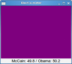
I don’t have the necessary hardware though, so I took the code and made a software version:

elect-o-meter

The purple will become more blue or more red depending on who is winning, and then when a winner is declared it will turn fully red or blue. Because the purples are very difficult to discern by eye, I print the actual percentages below.

Here’s the source code. Just run it on a Linux machine and it should work.

I Am Free, and so are you

Jewel Logo

Category: Accessories
Released Aug 9, 2008
Seller: N/A
(c) 2008 Owen Williams
Version: 1.0
24K

The red icon on your Nokia N800 or N810 always reminds you (and others when you show it to them) that you appreciate freedom. It’s a work of art with no hidden function at all.

You are free to install it from the Application Manager from the Extras repository.

You are free to install it with one-click download:

Chinook / Diablo (OS2008)

You are free to download it directly from my website:
i-am-free_1.0-1_armel.deb

You are free to download the sourcecode:
i-am-free_1.0.tar.gz

You are free to open it up, see how it works, make it better, email it to your friends, and do whatever you want.

What else are you free to do?

3 for 3.0, and Project Sandbox

There has been a lot of discussion recently about the future of GNOME and the stasis that the project seems to have reached ((I dislike the term “decadence,” because it seems to imply abundant wealth going to waste. GNOME will never be the wealthy-person’s OS of choice. That would be OS X)). I think that stasis is not a horrible place to be. As others have said, having a desktop that is stable, useful, and predictable is a good thing. Developers have worked hard to get the desktop where it is, so let’s give them all a pat on the back before we discount all that’s been achieved.

But, as an application developer, I see some shortcomings to GNOME that is preventing further progress in user interface design. There are technical limitations, but there are also social limitations working against progress. On the technical side, GTK needs some changes to allow more developers to take user interaction to the next level. On the community side, there needs to be an official GNOME-sponsored forum in which to experiment free from criticism.

To enable developers to try new things, GTK may need to break ABI stability and move to version 3. I call it “3 for 3.0” — the three features GTK needs to move forward:

  1. Multi-input from the ground up: Right now GTK reacts to one event at a time. It’s possible to make an application look like the user is doing many things at once, but true multi-touch and multi-user interaction is not really possible — or at least it’s too difficult for moderately-skilled developers (like me) to achieve.
  2. First-class Animation: GTK needs to perform animation by default. There are ways to make widgets spin, slide, and fade, but they are all hacks. I should be able to fire off an animation and perform other functions while it is animating. I should get a signal when the animation is complete. Built-in state management would be a key feature. There should be a standard library of basic transitions and special effects that anyone can use with minimal code (like fade, push, wipe).
  3. 3D-awareness: GTK doesn’t need to be 3D itself, but it should understand and be ready for 3D. 2D apps will never disappear, but there will be a need for a bridge between 2D and 3D. This could mean that GTK would support a z-buffer, or perhaps it would have a blessed 3d-canvas like Clutter. Or perhaps it could have access to OpenGL to provide various compositing and shader effects.

Perhaps some of these effects seem only useful for pointless flourishes that will slow down interactivity and increase processor overhead. I would argue that what GNOME needs right now is some stupid slow-ass eye-candy. Look at Compiz Fusion. It has dozens of gaudy effects, half of which are useless and most of which have way too many settings. But I love playing with it. It’s been a fertile sandbox for developers to go in and see what works. Maybe the “fire” transition is a waste of time, but there are a few Compiz features that are genuinely useful and I use all the time. The “enhanced zoom” feature, for instance, is a perfect way to blow up a youtube video without making it full-screen.

Every now and then I see a screencast from a GNOME developer working on a little pet project, and some of those demos have been amazing. Whenever I go to the GNOME Summit in Boston, there’s always some guy with his laptop, and he says, “take a look at this –” and proceeds to blow everyone away with some awesome thing he’s been working on. It’s rare, though, for those hacks to escape from that single laptop onto anyone else’s.

GNOME needs a Project Sandbox — an official, gory-edge (it’s past “bleeding”), parallel installable set of libraries and programs (“Toys,” perhaps? ((The exact terminology isn’t important, I’m just keeping the Sandbox metaphor going))) with all of the crazy hacks developers have been trying. It should be housed in a distributed SCM, so developers can push and pull from each other, mashing features and screwing around with GTK “3”, Clutter, Pyro, and whatever other toys people come up with.

The Sandbox should have two rules:

  1. No Kicking Sand ((alternate title: “No Pooping in the Sandbox”)) — ie, no stop energy. Anything goes, no matter how hacky. Developers should be able to prototype ideas quickly, no matter how cracked up they may be. The good ideas will stick and can be re-written cleanly. Nobody, not Apple, not Microsoft, not Nokia, knows what will really be useful in the future with multi-tap and 3D. Apple has a head start, but that doesn’t mean they have all the answers.
  2. Anyone Can Play: If I pull from your tree, I should be able to build and install what you’ve made. It does no good to have a toy if it only works in your corner of the sandbox. There might be some cases where a feature requires a certain video card, but developers should make a good faith effort to make code build and install on systems other than their own. Setting up a development environment is Hard, but I wouldn’t care if I needed 4 hacked copies of GTK each with different .so-names. Disk space is cheap! Computers are fast!

GNOME has done a good job of reining in developer craziness and promoting consistency and uniformity across the desktop. That was good, and was necessary while the desktop was maturing. Now it’s mature, and those reins need to be lifted, or at least relaxed. The stable desktop can plod forward steadily, but developers need a place to relax, rip off every feature from the iphone and Vista, and more importantly make that code public without fear of attack. What’s worse than a flame on Planet Gnome in response to a crazy feature? The feature that doesn’t get written for fear of being flamed.

Converting Varicam 48fps to 24p

Warning, technical video post production post ahead.

A few weeks back we needed to shoot some greenscreen for a show that is being delivered at 23.98fps (aka “24p”). I’d had problems pulling a key in the past with motion blur at that slow framerate (I prefer 30 for TV work), so I suggested we increase the shutter speed in the camera. The DP seemed more comfortable adjusting the framerate, so he suggested we shoot it at 48 and only use every other frame of the footage. I figured I could write a script to do the conversion later.

We shot the footage, and the next week I sat down to write a python program to convert the material to 24 fps. This could have probably been done with final cut or something, but I don’t know that program so I did it the easy way: play around with the frames themselves using an image sequence (ie, a big folder of numbered tif files, each of which represents a frame of footage).

Normally this would be easy, just take every odd-numbered image. But in this case, although we shot at 48fps, the footage is at 60fps. Why? Varicam works like this: the front of the camera (the shutter and CCD) shoot whatever framerate you choose, but the tape recorder in the camera always records 60fps. Even if you shoot 6fps, the varicam writes 60 frames to the tape — 10 of frame 1, 10 of frame 2, etc. So when we shoot 48fps, there are 60 frames per second on the tape, 48 of which are unique and 12 of which are duplicates.

If I am going to convert the footage to 24p, I need to first remove the duplicate frames (60 -> 48 fps), then remove every other frame (48 -> 24). By analyzing the footage frame by frame, I determined that when the varicam shoots 48fps, it uses the following pattern:

0000100001000010001

Where 0 represents a unique frame, and 1 represents a duplicated frame (to fill out to 60fps). This pattern is repeated over and over again throughout the footage. (I only just noticed that the pattern is 19 frames long, not 20 like I’d expect, but looking at the footage that’s what it is.)

My python program goes through an image sequence, finds the pattern of duplicate frames, and then copies every other file that is not a duplicate to a new folder as a new image sequence. It makes the following assumptions: the files are .tif files, and “duplicate frame” means “exactly the same size” (not a bad assumption with digital media and tifs). It’s a little hacky, but looking at the resulting 24fps image sequences I don’t see any stutter or dropped frames.

There are some basic checks in the code so it hopefully won’t overwrite precious data, but I make no guarantees.

Code: 48-to-24.py

PenguinTV’s third platform: maemo

This weekend I hosted a little maemo hackfest with my friend Mike with my goal being to get PenguinTV to launch in the maemo development environment. This meant building python support for mozilla embedding, which was hard. I’m used to checking out code and then building it, but the process of building the microb-engine packages was incredibly obtuse, and had no documentation. But I tried one thing, then another, then another, and finally it worked.

Once the gtkmozembed python module was finally built, porting the application was relatively easy. GTK is really wonderful because you can extract widgets, move them around, and plug them back in where you need them. I can take a toolbar that normally goes here and plug it in there, I can take a preferences window and throw in a scroll bar, and I can turn off that menu item or that button if it doesn’t apply. Sprinkle “if RUNNING_HILDON:” checks where necessary, and:

PenguinTV on Maemo

I always have to do some extra gymnastics because my program requires a lot of special startup initialization and shutdown finalization, but other than that the port was nice and straight-forward.

I’m now working on using all of the maemo-specific features like hardware buttons, network connection, and system messages. It should just be a matter of hooking up to some basic signals to existing functions.

My only big concern about is the “state-saving” feature that allow hildon to completely shut down a program when the user switches away, then restored when the user switches back. Because of all of my threads, database connections, and caches, my startup and shutdown are very slow. I’m not sure if it’s going to be possible to save fast enough. I also don’t know if it’s possible to save the scroll position of a mozilla widget, because when the user switches back they’ll expect to have everything scrolled how they left it. Since gtkmozembed is a black box, it’s just going to start scrolled at the top, which is not acceptable.

Along with olpc and the desktop, PenguinTV now runs on three different platforms using a single code-base.