GNOME Shell is an interesting project that is trying to redefine how users interact with their applications, windows, and documents. The project shows a lot of promise, and works quite nicely in practice. While I like the overall design, I dislike the current system for launching common applications. Right now, the “activated” mode of GNOME Shell looks like this:
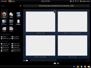
Nine spaces for commonly-used programs? Not enough. Furthermore, if I just want to launch a program, I have to reveal dozens of UI controls that I’m uninterested in, including the search box, workspace manager, and all sorts of devices, places, and documents.
On my personal GNOME desktop, I have a panel of quick-launch icons on my desktop arranged on the left side of the screen like this:

It’s similar to an OSX Dock — it is normally hidden, but a simple mouse hover anywhere on the left edge of the screen reveals the launchers. This makes it very quick to launch programs. Since the current GNOME Shell design already makes use of the left side of the screen, it should be possible to combine the efficiency of a launcher panel with the power of the full shell. Clicking on the Activities button or moving the mouse to the top left corner of the screen would open the full view like it does now, but hovering on the left edge of the screen would just pop up a panel of application launchers.
I made a very simple mockup based on the one by William Jon McCann:
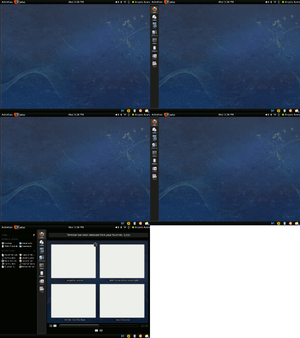
The launcher panel becomes a sort of sneak-peak of the full view. If you just want to launch a program, just the left edge of the panel slides into view. If you want the rest of the controls, the rest of the UI slides out. With the right animation, this could be a really cool effect.
This mockup is far from perfect. The part that needs the most attention is the full view:
There are a lot of details that are easy to criticize here. The “Applications” heading is quite small, and very crowded. The ugly [+] button at the bottom is an afterthought to provide some way of adding more launchers. The launchers are still too big, especially with the application name text underneath each one.
Despite these layout flaws, I think the concept holds up. In its completely collapsed mode, the slight visible edge of the launcher panel acts as a hint to new users that there is functionality to the left side of the screen. The half-revealed launcher panel is efficient and usable. And the full view provides the screen real estate necessary to customize the more compact view.
Launching programs needs to be super-simple for new users, and super-quick for advanced users. This design satisfies both these requirements. I would also argue that it leads users from familiar territory, a launcher bar, to a new UI concept that’s a little strange at first. Introducing a brand new interface is scary for users, so providing this path would make adoption easier.
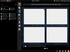
Here are the three states for the new shell:


Having a quick launcher for GNOME Shell is the feature I missed. I think this is a really good idea! I don't want to move to overlay mode, every time I want to start an application, since it distracts so much, if the screen is reconfigured every time!
However, I'm not convinced of placing it on the left screen and auto-hide it, for various reasons:
1. Auto-hiding is confusing for users, who are not used to use GNOME. They don't know, that this panel exists.
2. Auto-hiding disturbs you, if you want to use an application that has controls on its left window border (e.g. the main toolbar of Inkscape).
3. I think auto-hiding is also bad, since you don't know where to click, unless the control appears. For example: if I want to start the Terminal, I have to carry out the following steps:
- 1. move the cursor to the right corner of the screen
- 2. wait until the launcher panel appears
- 3. move the cursor to the terminal icon
If the launcher panel is visible all the time, you can know, where to find the button, you want to click on. Therefore you can reach it faster. (I think the auto-hiding of the dock on MacOS X is one of the worst things they did!)
4. You are wasting space. There is this empty panel on the bottom of the desktop, where nothing is placed on (beside the notifiers). There is the panel on the top, where nothing is placed on, beside the system control, the activities menu, the application date and the current date/time. And now you are introducing a third panel, for using launchers? For me, this looks like wasting space...
Why not placing the launchers in one of the panels?
5. The highlight that is under the application name is not easy to see. It would be better, to highlight the icon somehow.
(Please don't understand me wrong: I like the idea of having launchers outside the overlay mode. I even think, this is a *must*. But I don't like the idea of an auto-hide panel that is placed on the left corner of the screen...)
Hi Owen, I really liked your idea for a vertical App Well/launcher. I made some new mockups of how it could also function as a taskbar/window switcher and posted the ideas to Bugzilla as a recommendation to the developers for handling taskbar issues. If you are interested, or have any other cool ideas like this one, you could pop over and join the conversation. (See: https://bugzilla.gnome.org/show_bug.cgi?id=594931) To just jump and see the mockups, they are here:
1) http://www.flickr.com/photos/26671354@N05/4111218096/in/photostream/
2) http://www.flickr.com/photos/26671354@N05/4111218136/in/photostream/
Thanks for the comments.
Regarding auto-hiding, it is common to make this a configurable option (which is heresy on the GNOME desktop, I know) so that's easily solved -- and auto-hiding may disturb *you*, but I like it just fine :). I set my autohide animation speed to "fast", and the tiny delay is low enough that I don't notice it. And, because I can see a little of each icon even when the current panel is hidden, I know where to aim for when I want to select something. The current panel works very nicely.
As for the bottom panel, I don't even know what that's for in GNOME Shell, I just left it in the mockup.
@Brian,
thanks for the link. I read through the bug report, and I'll probably weigh in. I was more concerned with task launching, rather than task selection, so I'm not sure if our ideas are compatible. Of course, we could always mix the two, and then we'd have reinvented the OSX Dock. People really hated the Dock when it first came out, but I think users are accustomed to it by now.
Also, if people prefer the task switcher as a bottom panel, I don't see why the whole overlay view couldn't move to the bottom. Or the right. It should probably be configurable eventually for LTR RTL reasons anyway.
@Owen:
Okay, making the auto-hide optional, is okay. I don't think, it should be the default - since it is too hard for novices to know where to find this bar. (Perhaps if it appears in the activities screen, as you proposed, it might be okay to auto-hide it per default)
I still think, it should be placed on the bottom of the screen (or on a configurable edge). If you have auto-hide disabled, this concept would waste a lot of space on the screen.
Also it is a little bit problematic on multi-head solutions, since you never know, which screen is the more important for the user (the left or the right one). Therefore I still propose to place it on the bottom per default...
@Brian:
I like your approach of showing the windows of an application in a bubble over the application panel. It combines the best of the Dock of MacOS 10.6 and the new task bar of Windows 7.
But I'm not sure, if it really is a good idea to switch to expose mode, when showing the bubble. I'm using Linux and MacOS X for years, and I just hate Exposé, since for each window switch, my screen changes completely, which is very irritating. (And its just more irritating, since Exposé rearranges the windows every time a new window appears).
Things are just easier to use for humans, if they stay on the same position all the time - and (at least my) the brain has to compute less information, if the screen does not change too often completely. Since switching windows is a very important job, it should be as smooth and simple (to anticipate) as possible...