Rapid Development, aka Chaos

Now is a shitty time to be a GNOME user. However, I’ve realized that’s because now is a really interesting time to be a GNOME developer. The linux desktop is undergoing a period of transition, one that hasn’t been seen since about 2002 when GNOME2 began to replace GNOME1. ((KDE users went through the same thing in 2007 when KDE4 replaced KDE3, to much uproar.))

After ten years of development, the core GNOME libraries have grown old and crusty and not suited to the post-desktop world that phones and tablets and connected TVs are ushering in. Sure, linux was doing fine for a specific arrangement of screen, keyboard, and mouse, but if linux wants any presence on devices that don’t have these peripherals, it needed to change.

For developers, this is a lovely time to throw spaghetti at the wall and see what sticks. There’s a ton of innovation happening right now and lots of experimentation is going on that is exciting to watch. Every day brings an exciting new demo of an idea for workspace management, or search functionality, or UI innovation.

But these new desktops simply aren’t ready yet. The current situation from a user perspective is one of multiple, competing, buggy, slow, unfinished desktops that don’t live up to the functionality that users are accustomed to. There’s Unity, Gnome-Shell, GNOME Classic, Trinity, and KDE4. Many of these desktops use completely new user interaction systems, introducing a lot of unfamiliar concepts while tossing out a lot of a desktop user’s knowledge.

Change is hard, and change from something that worked to something that doesn’t is a recipe for angry users. The transition from GNOME2 technologies to GNOME3 has clearly been bungled. Distributions were too quick to push users out of very capable desktop environments and the “fallback” options (especially GNOME Classic) are too well-hidden and half-baked. Distributions needed to give users more time — I mean literally years — to try out the new desktops and reject them if necessary. Lots of people are sitting on Ubuntu 11.04 or even 10.10 for fear of being pushed into using a new desktop. ((Long-Term Support versions are probably supposed to fill this gap, but many people have already moved to Ubuntu 10.10, which is past 10.04LTS))

I look forward to switching to Unity or GNOME3, but only when I’ve decided that they are ready for me. I’m old enough now that I just can’t put up with a lot of bullshit, and I will stick with what works for as long as I need to. So I’m using GNOME Classic with a bunch of hacks that make it work like my old desktop. It’s probably too late to resurrect the trusty GNOME-panel interface, but there should be a clear, simple migration path from GNOME-panel to the new GNOME Classic Mode. Sure, load Unity or GNOME3 by default, but if the user selects GNOME Classic the old settings should be invisibly ported as best as possible.

Reordering Indicators in Ubuntu

Now that the GNOME panel is dead (long live the panel), the next best option for displaying system information in the upper menu bar is Ubuntu’s Indicators. Indicators are a much less powerful system than the old panel once was, due to various tradeoffs of complexity for ease-of-use. One limitation is that indicators seem to appear in a random, arbitrary order. I’d prefer to arrange the indicators myself. For instance I’d like to have all my system monitors grouped together.

It turns out there is a way to reorder the icons, but it’s tricky. These instructions assume you know how the command line works and can read a process list without getting worried. Until the Ubuntu developers add the ability to reorder indicators this is the only way to do it. This page gave me a good head-start. You have to start by creating a special “override” file that will tell the indicator applet how to reorder the icons. Start by creating the override file with the system defaults:

mkdir -p ~/.local/share/indicators/application
cp /usr/share/indicator-application/ordering-override.keyfile ~/.local/share/indicators/application/
gedit ~/.local/share/indicators/application/ordering-override.keyfile &

My default file looked like this:
[Ordering Index Overrides]
nm-applet=1
gnome-power-manager=2
ibus=3
gst-keyboard-xkb=4
gsd-keyboard-xkb=5

The next step is tricky: You’ll need to add each indicator to the file and assign it a number (lower numbers are further to the right), but what do youo call each item? In many cases (but not all), the name is the same as the executable. indicator-cpufreq is just indicator-cpufreq. Run this command to list all the indicators running on your system:

ps xa |grep indicator-

Other applications, like Tomboy, set up their own indicator name. We need a way of finding out what that name is.

The only way I know of to find this name is to rerun the indicator service and read through the debugging output. Yeah, I know. Warning, this process may mess up the display of your indicators. Nothing done here is permanent, so you can always log out and log back in to restore your regular desktop.

Try this:
killall indicator-application-service && /usr/lib/indicator-application/indicator-application-service

Much text will start spewing. If the command prompt comes back right away and you see the following text, just try the command I gave you again:

(process:7601): libindicator-WARNING **: Name request failed.
(process:7601): indicator-application-service-DEBUG: Service disconnected
(process:7601): indicator-application-service-DEBUG: Application proxy destroyed '(null)'
(process:7601): indicator-application-service-DEBUG: Application free '(null)'

Look for lines like this:
(process:7672): indicator-application-service-DEBUG: 'bluetooth-manager' ordering index is '20626C75'

This tells you two things: bluetooth-manager is the name of this particular indicator, and that’s what you’ll want to put in your override file. Also, 20626C75 is the current ordering index. Because it’s a long number, this value is not currently being overridden.

Now we want to make some changes.

Edit your override file. Here’s mine:
[Ordering Index Overrides]
nm-applet=1
gnome-power-manager=2
ibus=3
gst-keyboard-xkb=4
gsd-keyboard-xkb=5
indicator-penguintv=6
tomboy-notes=7
multiload=8
indicator-sensors=9
indicator-cpufreq=10
indicator-sysmonitor=11

The rerun the command I gave you. You should see some changes:

(process:7672): indicator-application-service-DEBUG: 'indicator-sensors' ordering index is '9'

This means that I successfully assigned the ordering value of 9 to indicator-sensors. And indeed, all my indicators are in the order I want.

When everything is how you want it, log out and log back in to make sure the changes worked.

update 10/19/2012:

there’s a better way to list running indicators:
dbus-send --type=method_call --print-reply \
--dest=com.canonical.indicator.application \
/com/canonical/indicator/application/service \
com.canonical.indicator.application.service.GetApplications | grep "object path"

This will print out the running indicators. replace underscores with hyphens in the keyfile

Ideas for GNOME Shell

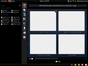
GNOME Shell is an interesting project that is trying to redefine how users interact with their applications, windows, and documents. The project shows a lot of promise, and works quite nicely in practice. While I like the overall design, I dislike the current system for launching common applications. Right now, the “activated” mode of GNOME Shell looks like this:

Current GNOME Shell mockup

Nine spaces for commonly-used programs? Not enough. Furthermore, if I just want to launch a program, I have to reveal dozens of UI controls that I’m uninterested in, including the search box, workspace manager, and all sorts of devices, places, and documents.

On my personal GNOME desktop, I have a panel of quick-launch icons on my desktop arranged on the left side of the screen like this:

My Current Panel (click for big)

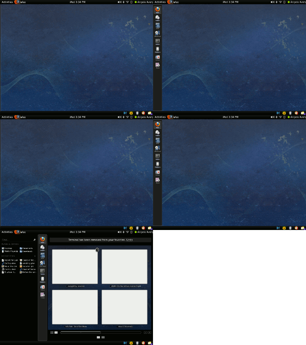
It’s similar to an OSX Dock — it is normally hidden, but a simple mouse hover anywhere on the left edge of the screen reveals the launchers. This makes it very quick to launch programs. Since the current GNOME Shell design already makes use of the left side of the screen, it should be possible to combine the efficiency of a launcher panel with the power of the full shell. Clicking on the Activities button or moving the mouse to the top left corner of the screen would open the full view like it does now, but hovering on the left edge of the screen would just pop up a panel of application launchers.

I made a very simple mockup based on the one by William Jon McCann:

My GNOME Shell mockup (click for big)

The launcher panel becomes a sort of sneak-peak of the full view. If you just want to launch a program, just the left edge of the panel slides into view. If you want the rest of the controls, the rest of the UI slides out. With the right animation, this could be a really cool effect.

This mockup is far from perfect. The part that needs the most attention is the full view:

gnome-shell-owen-a-1

There are a lot of details that are easy to criticize here. The “Applications” heading is quite small, and very crowded. The ugly [+] button at the bottom is an afterthought to provide some way of adding more launchers. The launchers are still too big, especially with the application name text underneath each one.

Despite these layout flaws, I think the concept holds up. In its completely collapsed mode, the slight visible edge of the launcher panel acts as a hint to new users that there is functionality to the left side of the screen. The half-revealed launcher panel is efficient and usable. And the full view provides the screen real estate necessary to customize the more compact view.

Launching programs needs to be super-simple for new users, and super-quick for advanced users. This design satisfies both these requirements. I would also argue that it leads users from familiar territory, a launcher bar, to a new UI concept that’s a little strange at first. Introducing a brand new interface is scary for users, so providing this path would make adoption easier.

Here are the three states for the new shell:

gnome-shell-owen-c-1 gnome-shell-owen-b-1 gnome-shell-owen-a-1