The Anti-Gadget

There’s an interesting article at raisethehammer.org that J5 linked to. It brings to mind some issues I’ve been thinking about ever since I started working on the XO, and moreso since Apple announced the iPhone.

The article ends this way:

When the Children’s Machine becomes available, one thought is that customers in the developed world could buy two machines, with one going to a child in the developing world. Buy one for the price of two, in other words.

If that happens, gadget lovers will have an interesting choice to make this year.

A lot of people have been salivating over the XO, and they are viewing it through the same lens as other products: as a gadget. I think this is a critical mistake, and by labelling the XO a “gadget” one loses sight of what the XO was designed for. If anything, I think the XO is the Anti-Gadget.

I would define a gadget as something Unuseless. It does appear to fill some need, and one can construct arguments in favor of purchasing it, but ultimately the purchase is discretionary.

I think a lot of people in the first-world see in the XO its gadget potential, like its dual-mode screen, mesh networking, or built-in camera. For most of us these features are unuseless — I never use my laptop in bright sun so I don’t need a dual-mode screen, I am always near an access point so I don’t need mesh networking, or I already have a digital camera.

But in the environment for which the olpc was designed these features are necessities. Without the dual-mode screen the laptop would be useless in outdoor classrooms. Without the mesh there would be no network infrastructure. The camera may be the first that many children have used and it may also be their first mirror. Every part of the laptop has been carefully chosen with these issues in mind.

If the XO was released to first-world consumers too soon I’m afraid that all context would be lost and it would be directly compared to the iPhone, the Nokia N800, or the latest tablet PC. Reviewers would apply their standard series of benchmarks and it would probably fail: it wouldn’t be able to play back HD video, it wouldn’t have a slick 3D desktop, and it surely wouldn’t synchronize their Office documents.

It’s important not to judge the XO by the standards of gadgets designed for the first world market. For once, wealthy Americans are not the target market for a new device. Instead, try to imagine a child for whom this is their new textbook, calculator, telephone, synthesizer, and newspaper. Although the XO may seem like a gadget, it’s not at all a gadget to the child who will be getting it.

Game theory and movie piracy

I haven’t seen anyone else linking to this, but the blog Freedom to Tinker is doing a badass academic analysis of the effectiveness of HD-DVD AACS encryption using Game Theory. Rather than simply concluding that the studios are evil and hackers will beat the system, they’ve analyzed the encryption method to determine the optimal behavior for each side.

They come to a fascinating conclusion:

It turns out that the attacker’s best strategy is to withhold any newly discovered compromise until a “release window” of size R has passed since the last time the authority blacklisted a player. [. . .] Once the release window has passed, the attacker will use the compromise aggressively and the authority will then blacklist the compromised player, which essentially starts the game over. The studio collects revenue during the release window, and sometimes beyond the release window when the attacker gets unlucky and takes a long time to find another compromise.

They point out that this resembles the current studio model of release cycles:

Interestingly, this release window strategy resembles the studios’ current approach to extracting revenue from films, in which a film is available first in the highest-revenue format — in theaters — then later in a succession of lower-revenue formats — DVD and television. The idea is to extract more revenue from the most enthusiastic fans in early stages and pick up whatever revenue is available from everyone else later.

There are currently seven long articles about the topic, but they are all worth reading.

So wrong it can’t be right

Often in my work, I need to create a placeholder animation, text, or graphic before the final version comes in. The problem with a placeholder is that if it remains in place long enough, it can eventually be mistaken for the genuine article. A temporary font becomes the final font. A temporary, unlicensed, low resolution google image becomes the final production image for a high definition show. Usually these mistakes are caught toward the end of the production, and there is much panic as proper replacements are tracked down. Other times the placeholder wins and is broadcast. How can we make sure this doesn’t happen?

The more common solution to problems like these would be to write “PLACEHOLDER: LOW REZ” on a graphic, or something boring like that. This solves nothing. Everyone knows it’s a placeholder, but it’s always good enough “for now” and will sit around forever, never getting replaced until the very end. Maybe it’s less likely to go on the air, but there’s still a flurry of activity as the deadline looms.

My strategy is to make the placeholder so ridiculous and obviously wrong that no one could ever mistake it for being correct. If there’s a question of font, don’t use Arial as a temp font, use something crazy like a party font. If you have a temp graphic that’s too small, shrink it more and save it as a 25% quality jpeg. Even on a tiny screen everyone will see the image isn’t good enough for broadcast.

In one case I had to attribute a graphic to Google Earth. No one could tell me the font, size, or positioning to use, so I created a title with 80 point font that says “GOOGLE EARTH IS AWESOME!!!!!” right across the middle of the screen. That got fixed quickly.

In contrast, a “temp” sound effect in our show was meant to be replaced with a new, awesomer sound effect. Unfortunately because the “temp” sound effect was pretty good, it became the final sound effect. We knew it was a temporary sound effect, but there was no rush replacing it so we didn’t. Had the temp effect been more inappropriate, we would have gotten around to creating something better.

Is this the beginning of a series of Getting Things Done posts? Geez I hope not. I’d like to think there’s a difference between a silly font choice and reminding yourself to pick up milk using RSS feeds, Google Maps, and SMS Messages. Is it possible to blog about tricks like this and not be contributing to the whole efficiency / Web 2.0 / Moleskine cult?

Why RSS on a laptop for kids?

I’ve been happy to see some recent articles about the OLPC that mention PenguinTV, although not by name. The BBC and AP both mention the existence of an RSS reader, and both understandably felt it necessary to describe what that means:

BBC:

The machine comes with a web browser, word processor and RSS reader, for accessing the web feeds that so many sites now offer.

AP:

A wide range of programs can run on it, including a Web browser, a word processor and an RSS reader — the software that delivers blog updates to information junkies.

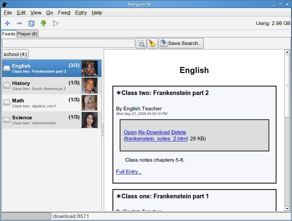
I have a feeling that people reading these descriptions will wonder why the heck 5th graders would care about RSS feeds. While these are decent enough descriptions of what RSS is traditionally used for, it misses the point of why I worked to bring RSS to the olpc. When I was envisioning how the children would use PenguinTV, this is what I saw:

School Example 2

(Let me be clear here, this was my own personal hope and dream. It does not reflect the official position of olpc).

What’s important are not the specific images, subjects, and examples I’ve used, but how the data are presented. On the left is a list of subscribed feeds, representing classes the student is taking. On the right is a list of entries, of which there is one per class session. Each entry has associated notes and classroom materials. Every day this information would be automatically downloaded to the child’s laptop from the school server.

I think future students (if not current ones) will expect all classroom materials to be available online, whether from an internet server or a school server. I know I would have appreciated all my homework assignments as downloadable PDFs instead of crumplable, tearable, losable paper. Furthermore lectures for older kids could be recorded as audio or video and attached to the entry, meaning older students could catch up on missed classes. The storage of all these documents is managed directly by PenguinTV meaning that the student doesn’t need to know exactly where the files are stored on the hard drive.

So while RSS is known right now as a standard for “news junkies,” I hope that people can see how it can be used in other ways, including a classroom context.

With the introduction of The Journal, PenguinTV’s role has changed. The Journal will be a central part of the laptop experience and will keep track of all the user’s activities and files in an interface that may look similar to the screenshot above. This makes PenguinTV somewhat redundant for those uses. It still may have a role in retrieving data or as an offline web browser, but it’s probably not going to be the central class materials browser I envisioned.

Lately, it seems that my software has turned out to be a good testcase as a large software program with lots of dependencies. PenguinTV relies on Mozilla (to draw feeds), GStreamer (for audio and video playback), SQLite (for data storage), BitTorrent (for large files), and more. This makes it a great full-featured desktop program, but strains the laptop’s RAM capacity. (Right now most of the RAM is being used by mozilla, so improvements being made there are the most beneficial). Most of my work has been focused on improving PenguinTV so that it runs leaner and faster. If I can get it to perform well on the tiny laptop, not only will it be good for the children (should they become news junkies :)) but everyone running the desktop version as well.

I’m not at all disappointed to see the Journal doing what I imagined PenguinTV might do. After all, it must have been a good idea if someone else came up with it! The Journal is going to be one of the applications most often used by the children, so it needs to be much, much smaller than I could ever make PenguinTV. Because the Journal won’t be using html they won’t need mozilla, and they will probably use a more efficient storage mechanism than sqlite. Also PenguinTV does not work well with many entries in one feed, whereas the Journal will need to work for years-worth of data. So while it won’t be my own software, the kids will be getting the computer I wish had been available to me when I was in school. Lucky punks!

PenguinTV database accesses: more optimal than ever!

I’ve been working to push database accesses down further on PenguinTV to lessen the load it puts on the disk. If the system is under heavy disk load to begin with, PenguinTV slows to a crawl and becomes unusable. Following up on my previous optimization work, a database hit for an unread entry is now this:

SELECT title, creator, link, description, feed_id, date, read FROM entries WHERE id=? (93729,)
SELECT id,entry_id,url,file,download_status,viewed,length,mimetype FROM media WHERE entry_id = ? (93729,)
UPDATE entries SET read=? WHERE id=? (1, 93729)
UPDATE media SET viewed=? WHERE entry_id=? (1, 93729)
SELECT id FROM feeds WHERE feed_pointer=? (322,)

We only read from each table once, and only write to each table once. That’s about as good as it can get, I think.

Lame bug of the day

I like evolution, I really do. At least that’s what I tell myself. I’ve used it for about six years and I’ve never once lost my mail, so I try to give it the respect it deserves. That said, this bug is totally lame. Basically, when using message filters, any actions after a “move” action are not performed. There is no documentation on this, no warning in the UI, and no indication that there is a problem at all. Instead messages mysteriously don’t get filtered correctly.

I know everyone has their pet bugs, and developers hate people with pet bugs, so I’m not going to press the issue. But I really think there should be some indication in the UI that “move message” is a final act and that nothing can happen afterward.

Adventures in virtualization

I’ve been adapting PenguinTV for use on the olpc, which is not entirely easy. For an all-python application it’s not too hard, but I have precompiled libraries that I need to distribute with PenguinTV because the olpc doesn’t provide pycurl. Since I run Ubuntu Edgy and the olpc is based on Fedora Core 6, I need to do some sort of virtualization to test my activity.

The recommended practice is to download an OLPC OS Image and run it with qemu. Unfortunately, the image is broken for Debian-based distributions like mine.

The next option is to download the OS image and chroot inside it and run sugar-emulator from there. That also doesn’t work for me.

My solution is really complicated: Run Fedora Core 6 in VMWare, and then chroot inside the OS image from there. Success!

So here’s a picture of PenguinTV, running inside olpc build 142, chrooted on FC6, running inside VMWare Workstation, on Ubuntu. It’s not a pretty way to do software development, but it seems to work.

inefficient_ptv.jpg

De-Crackification

I think I have removed all of the crack from my tag selector. It took about four different branches including experiments with treeviews, comboboxentries, menus, and entrycompletions. The final user experience is not overwhelming for users with few or no tags, and manageable even for users with many tags. Check out the final screencast.

Am I Crack or Not, part 2

I tweaked the new tag selector some more, although I’m getting the feeling that at this point I’m just trying to duplicate a combo box or menu. A few people have suggested I have a box where people can type in a tag name. I don’t want to add another entry box, so I think I might add that functionality to the main search box above the tag list. I still like being able to have a few tags that are always one click away.

Latest tag selector screencast

edit:
Actually the more I look at this, the more it seems like I really just want a regular drop-down menu with a submenu containing all tags. At the bottom of the main part of the menu I could have an item that would spawn a dialog that looks like my current view, and that would be just for selecting and reordering favorites.