When I was at the GNOME Summit a little while ago, there was a discussion about how to best use the new transparency features of X.org. The consensus was that it’s very hard to use transparency in a way that’s not annoying to a user. Mac OSX used to have their menus slightly transparent, but it ended up looking like the screen had burnin.
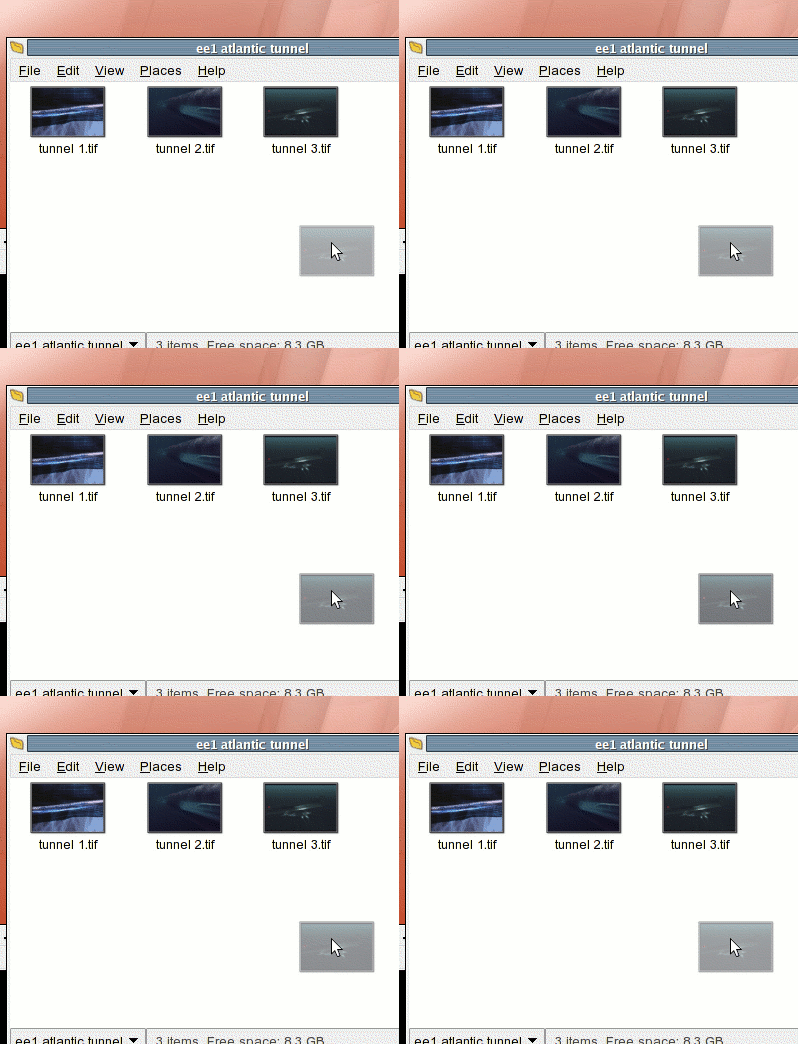
I had an idea this morning that transparency would be really useful for drag and drop. I’m always annoyed when I’m dragging a huge thumbnail around that I can’t see under it. You don’t need to see every detail of the thumbnail, so it’s all right to throw the opacity to 40%. You could even do something cute like have it pulsate. Oh look it’s a mockup.

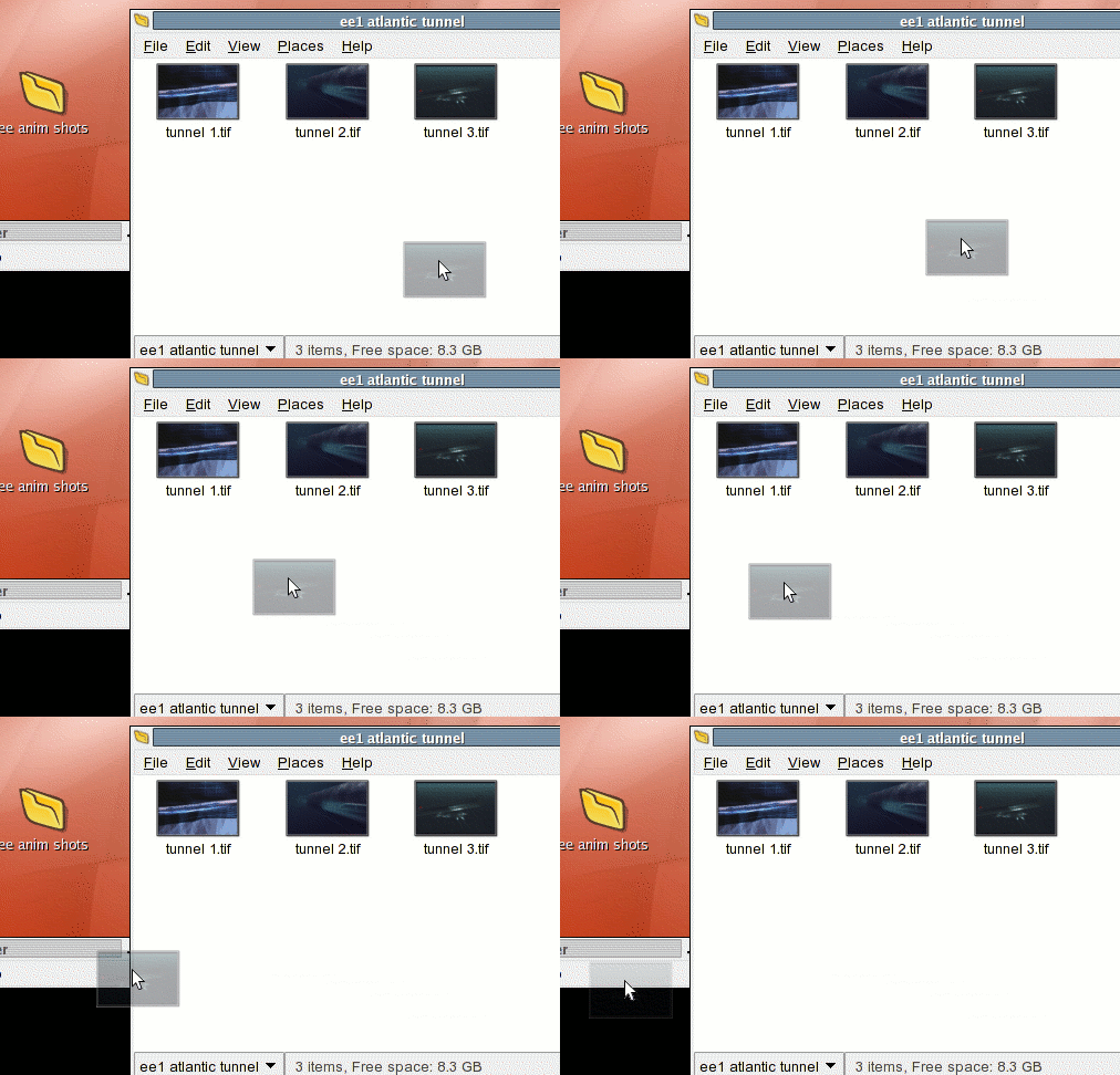
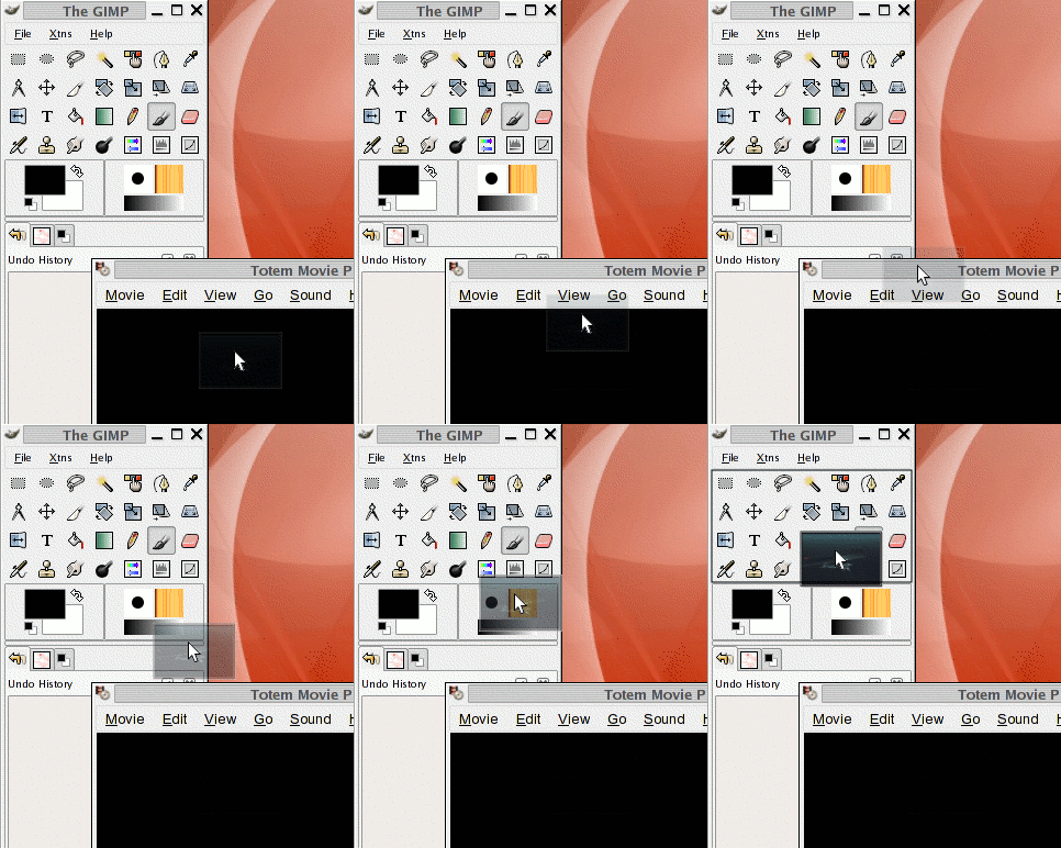
But beyond just making drag ‘n’ drop thumbnails partially transparent, you could also use the transparency to give visual feedback. So if you dragged an image, say, onto an application that doesn’t receive that type of item, like Totem Movie Player, then the thumbnail could get more transparent. This would mean “I’m not going to work here.” This mockup is a little crappy. The initial opacity should be a little more so that the contrast is more evident.

Then if you drag that item onto an application that accepts it, like The Gimp, the thumbnail would become more opaque,i indicating that the application accepts the item. You could combine this with the standard ‘+’ indicator that gets added to the cursor (not pictured).

This would be very easy to do, would look good, and would actually work well.
