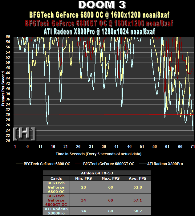
Apple isn’t alone in presenting data poorly. TardOCP is famous for its data-filled, yet totally useless diagrams. Note the inconsistant resolution settings and unreadable colors!
I guess this is a Tiny House blog now

Apple isn’t alone in presenting data poorly. TardOCP is famous for its data-filled, yet totally useless diagrams. Note the inconsistant resolution settings and unreadable colors!