NFL: Sitcoms
VW: Beetle
Looks like a Baselight grading room based on the panel design.
VW: The Force
I guess this is a Tiny House blog now
NFL: Sitcoms
VW: Beetle
Looks like a Baselight grading room based on the panel design.
VW: The Force
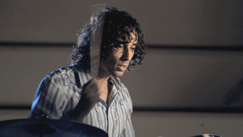
Recently I did some color correction for the dudes who did the stop motion fight video “Tony vs. Paul” you may have seen on youtube. They were doing a music video for the Gabe Dixon Band and needed someone to pull the excessive warmth out of the images. I brought over my trusty tablet and helped them find a good look for the video.
I’m happy with how it turned out. I was able to rediscover the colors that had been used to light the band, including a really nice blue rimlight. I took that same blue and pushed it into the shadows which really cooled the whole thing down. I also used a secondary correction ((secondary correction: A color correction that is only applied to part of the image. In this case, only parts of the image with a certain type of red were affected)) to boost the color of the red shirts which animate on-screen.
Unfortunately, the black levels are still too inconsistent, and the color grading introduced some ugly dithering and banding in the shadows ((the video was shot on the Red Camera, so this banding really shouldn’t have happened — I’m not sure where it came from)). Next time I’ll watch the blacks more closely and make sure they’re smoother.
You can watch the whole video (click through to Vimeo to see it larger) and I have some after-and-before stills below. Roll over the images to see how they looked coming out of Final Cut.
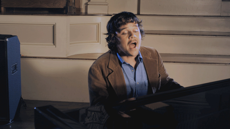
I had the good fortune of being able to grade (color-correct) a graduate student’s thesis project last weekend. It’s called Mel’s Hole, dir. Kenji Miwa. It was my first narrative project, and my first using Apple’s Color. I usually do documentary work, where the highest priority is to make the footage look “good” and consistent. Also, I’m used to the Avid color corrector, which is not very good for matted secondary color corrections (“brighten his face here”) so it would have been hard to do the sort of aggressive grading that the director wanted.
He’s given me permission to show some before-and-after shots from the film, showing off some of the more fun corrections I got to do. Mouse over the images to see the uncorrected versions. (Shot on a Panasonic HVX200 with a lens adapter for low depth-of-field.)
(Note, these images sometimes appear much too bright on a mac. Set your monitor’s gamma to PC / video standard (2.2) to see the night-time shots correctly.)
The above shot represents the basic look for the film, which is a desaturated “bleach bypass” look. It’s high contrast, with substantial crushing of the blacks and whites. In this shot, we had to knock down the colors of the blanket, which was still too saturated even after we applied the look.
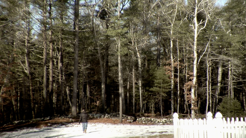
In this scene, the character walks into the woods, which were supposed to be dark and foreboding. By really crushing the blacks we were able to make the woods look deeper and more mysterious. This darkening caused the character to be somewhat lost in the busy-ness of the image, so I put a small tracked oval (the shot pans up) over the character to draw attention to him.
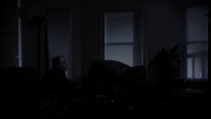
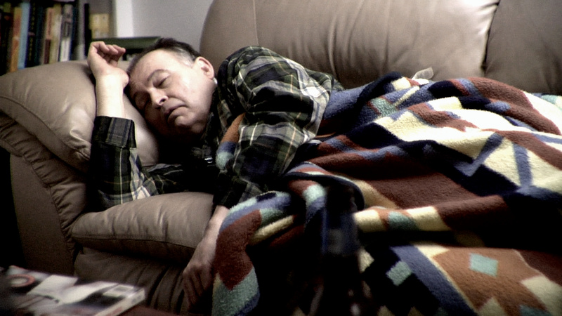
This scene takes place in the middle of the night, and I was instructed to make it very very dark, with a silvery-blue cast. Although the lefthand venetian blind did not have any light behind it, I was able to put one in, which serves to illuminate the character’s face (even though a light back there would really just silhouette him). There are still some bright highlights visible in the blinds, but I wasn’t able to get rid of them.
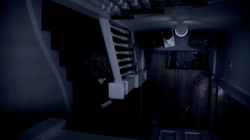
This shot was actually a last-minute idea. It is paired with another night-time shot, so we decided this shot should also be in night-time. I was able to do a good day-for-night, including drawing in the spill of the light at the bottom of the stairs.
I had a lot of fun doing this grade, and I really liked Apple Color — which makes sense, I doubt they would have bought a company that made a bad color correction program. I do have to say that the keyframing in that program absolutely blows, and the tracker isn’t great either. It also crashed immediately after finishing a render once. But on the whole, it was good at disappearing and letting me work.
The director and DP were great too. We hadn’t really done a lot with aggressive grading before, but once they saw what was possible they were able to direct me better and make requests that were creative but also doable.
World premiere is on May 2nd. The details are on Facebook.
(ps, just shoot me an email if you want me to grade your film — the first job is free!)